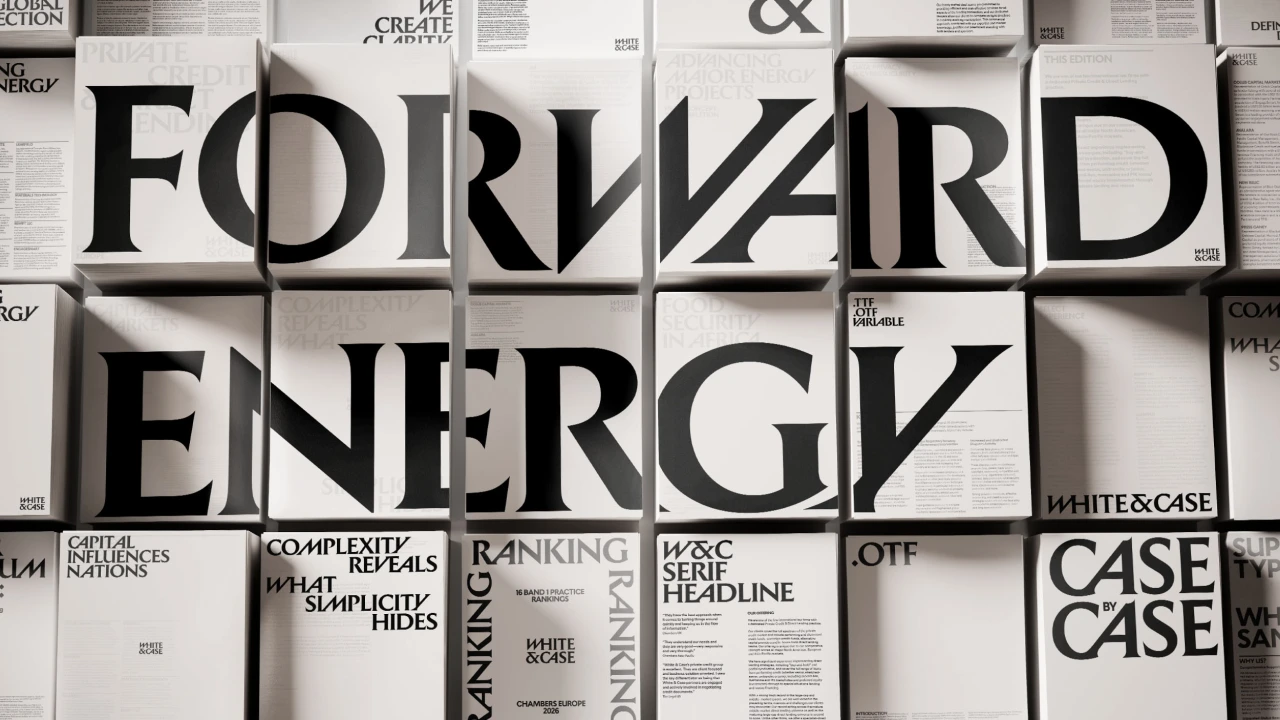
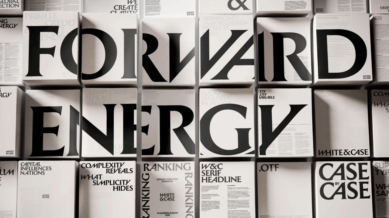
On a wall of White & Case layouts, saturated blue sits next to black type at a scale closer to a concert poster than a law firm brochure. Uncommon Creative Studio’s identity is built to survive that change in scale. The same name has to work on a business card, a train platform and a screen large enough to walk under.
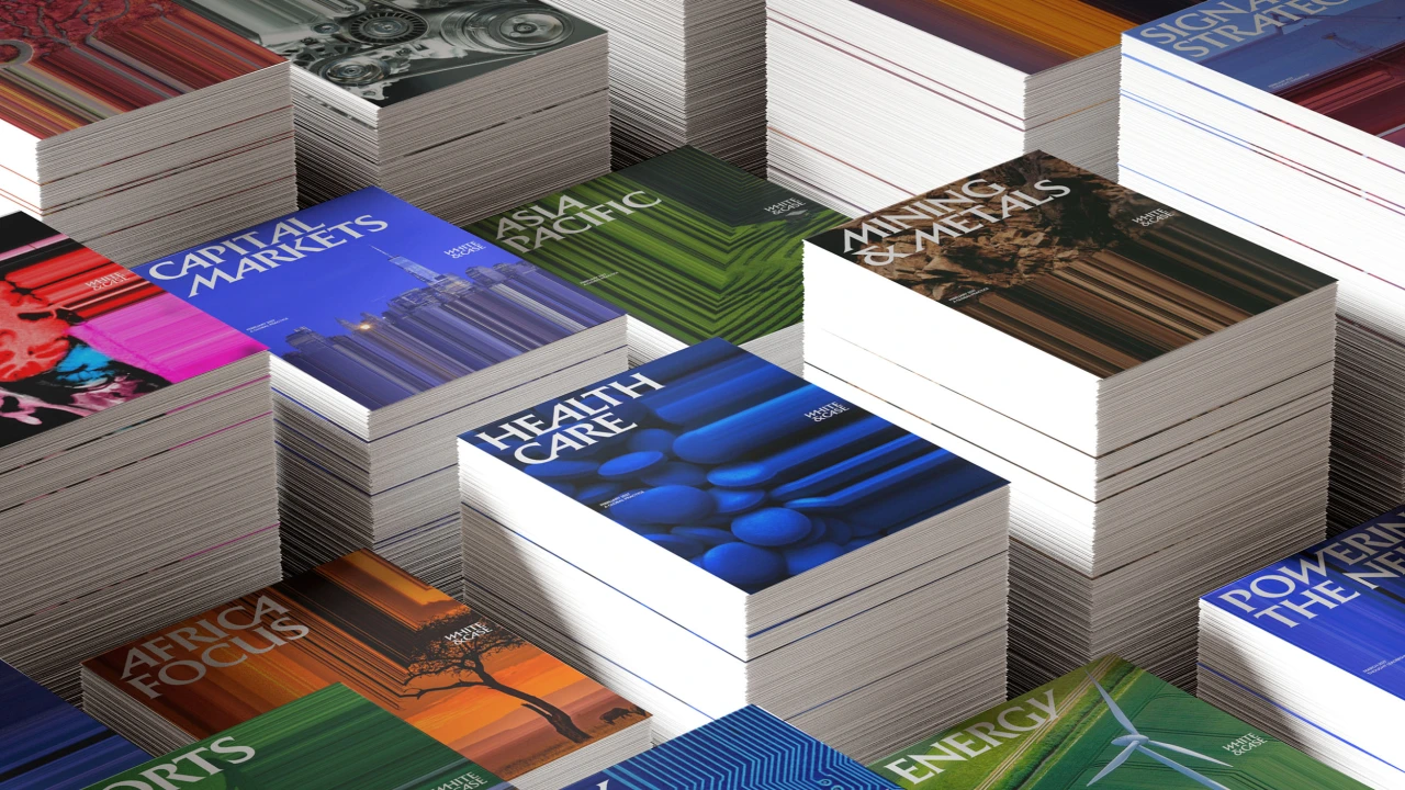
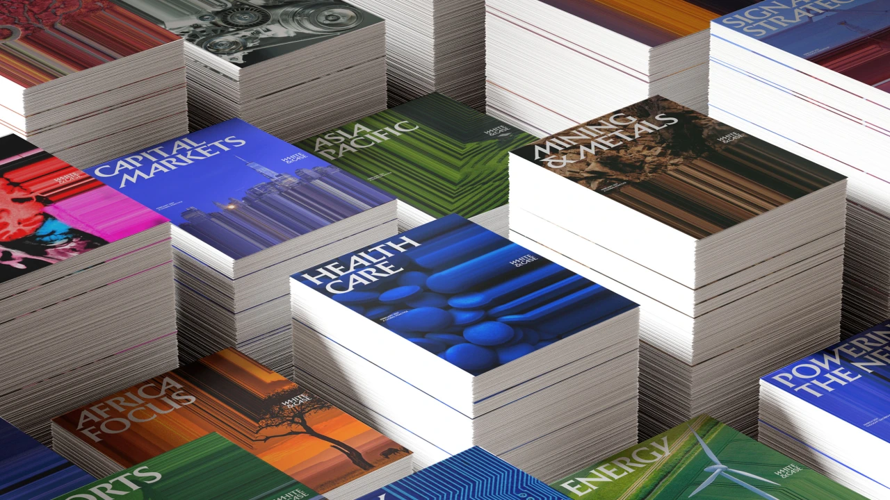
What makes the project worth a closer look is how it creates movement in print. The ingredients are simple enough to follow from one application to the next: lettering that leans, photographs that stretch and a blue that can carry an entire surface.
Lettering with a direction
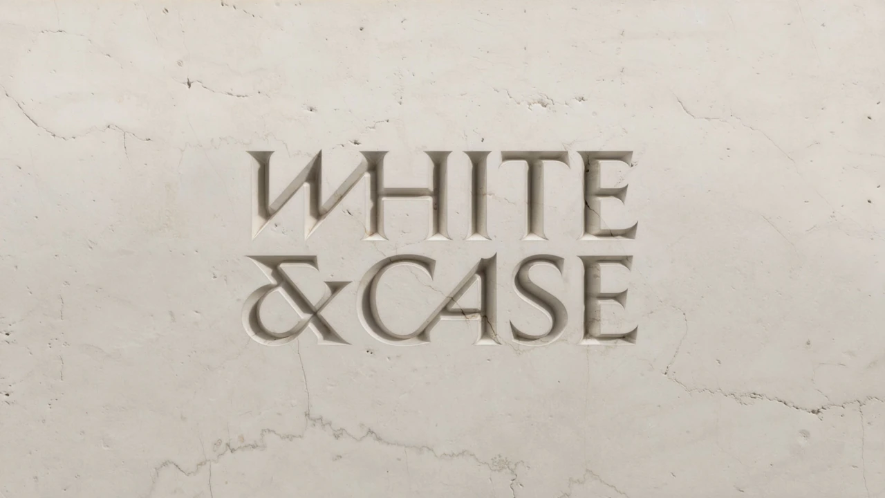
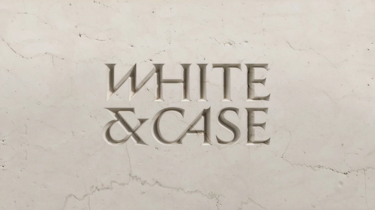
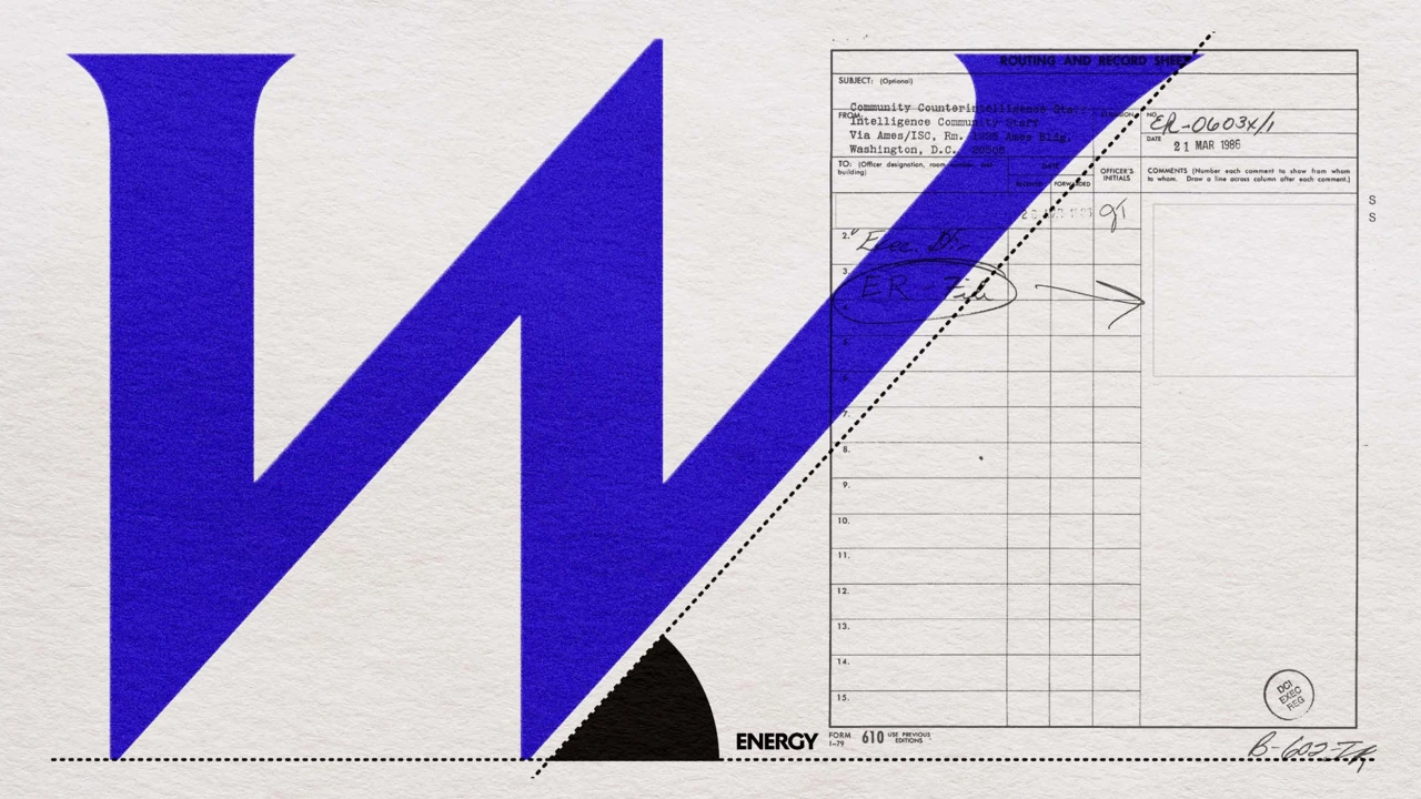
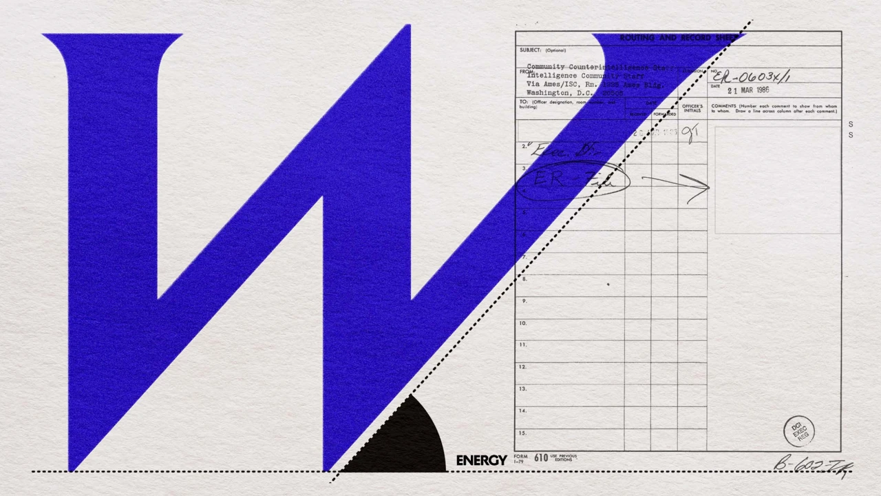
The stacked wordmark draws on Roman inscriptional lettering. Those origins are easiest to spot in the weight of the serifs. The diagonal cuts are what give the mark a direction, especially in the W. Look at it on the blue marble treatment and you can see both ideas at once: the lettering feels cut from a solid surface, yet its angles lead the eye out of the frame.
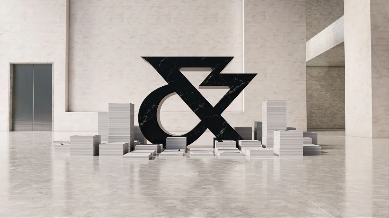
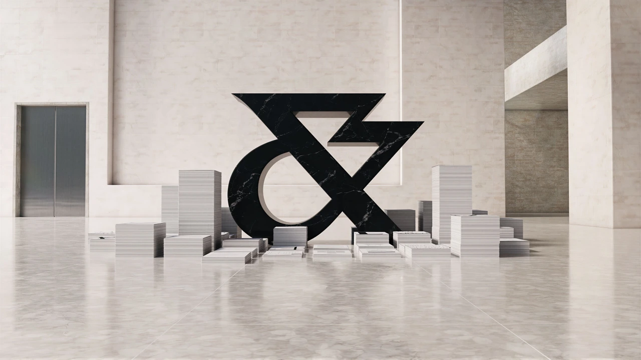
Separating the ampersand gives the identity another scale to work at. The full name can remain formal where clarity matters. In an installation, the ampersand can take over a room. Its curved silhouette provides some relief from the sharper edges of the stacked name.
When an image starts to move
Uncommon calls the signature colour Catalyst Blue. The strongest applications give it room. On an illuminated surface it reads as light, while on printed material it can sit next to a spare black-and-white layout and do the work of a headline.
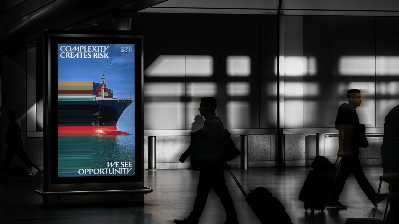
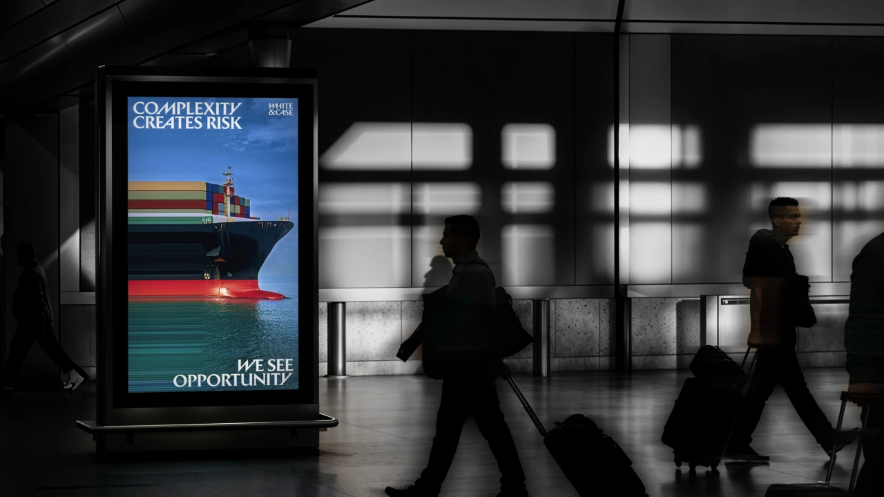
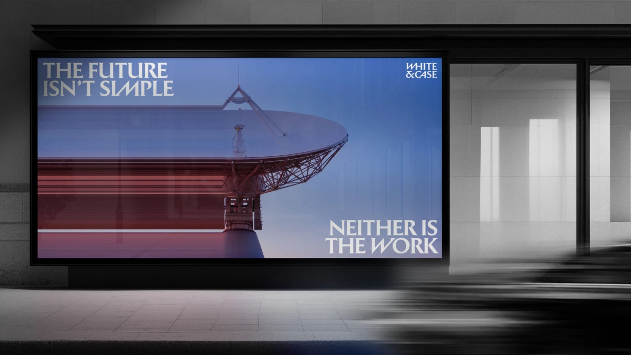
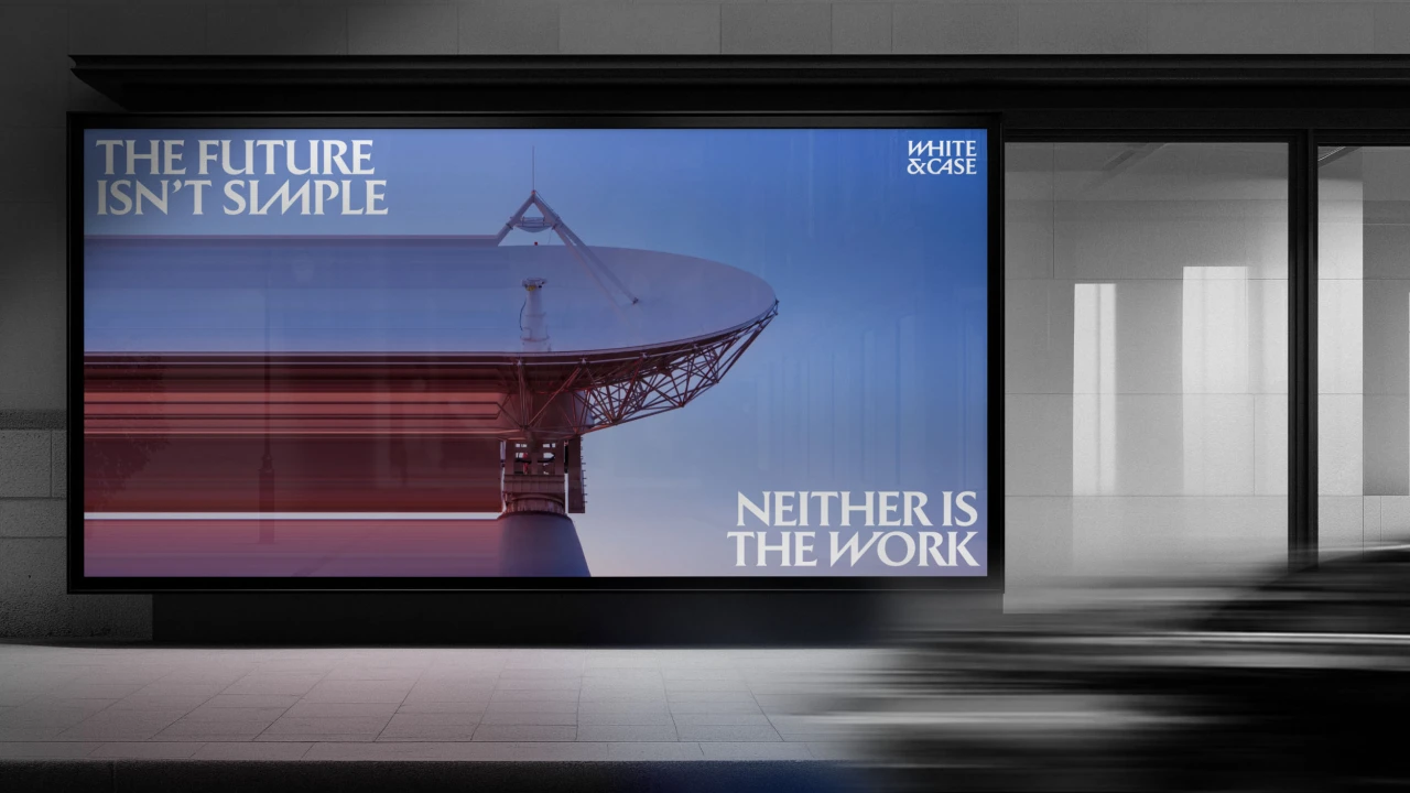
The studio’s Energy Studio tool stretches parts of photographs into coloured lines. Keeping a recognisable subject in the frame is what gives that treatment its force. The eye can identify the ship or satellite dish and then follow the composition into abstraction. The same device would lose much of its purpose if every image dissolved to the same degree.
A system with a volume control
The print materials show why restraint still matters here. A loud cover can lead into a quieter page. A bold letterform can carry a campaign while a smaller mark simply signs a document. The identity has enough distinct parts that each application can choose how much to use.
That range is what makes the system more interesting than the palette change alone. The blue gets attention quickly. The relationships between type, image and scale give the designers something to work with once they have it.
Sources and image credits
Written by The Hasel Magazine. Background reporting: Tom May, Creative Boom, 27 October 2026 and Ordinary Chaos, 30 October 2026. See White & Case for the identity in use.
Visual identity by Uncommon Creative Studio for White & Case. All seven project images are credited to Uncommon Creative Studio / White & Case and sourced from the Creative Boom feature. Each caption links to its original image.